From campaign planning to everyday execution, keeping projects on track isn’t just a creative challenge – it’s operational. As businesses scale, so does complexity. That’s where a transparent workflow makes all the difference.
In many industries, compliance isn’t just a requirement, it’s a strategic advantage. When built into the creative process, compliant design strengthens confidence and enables efficient, high-performing campaigns. The result? Greater clarity, cohesion, and control where it matters most.
Design is more than aesthetics – it’s a measurable driver of growth. And understanding which design trends actually move the needle is key to ensuring creativity translates into ROI, not distraction.
As organizations grow, keeping a unified brand becomes challenging. Messaging can drift, credibility can suffer, and audiences can disengage. But the challenge isn’t knowing consistency matters, it’s making it easy to maintain at scale.
Your website only has seconds to earn trust and capture interest. So what gets attention? Web experiences that are immersive by design, turning casual browsing into meaningful engagement and measurable results.
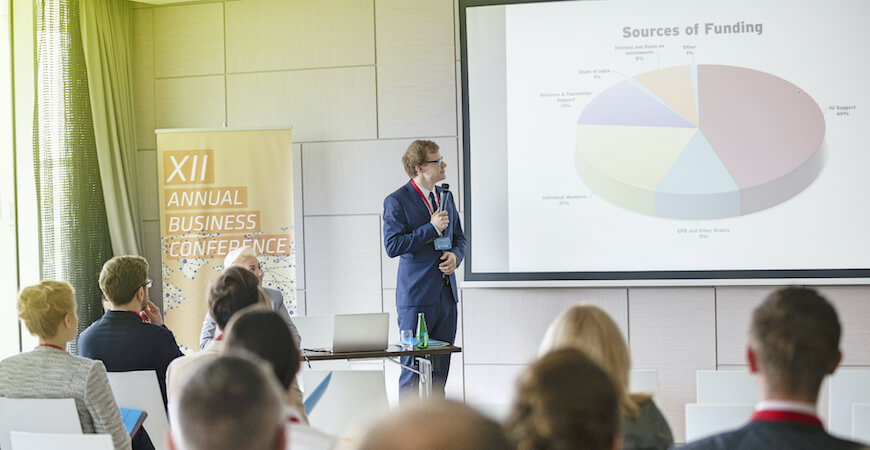
Conferences can be inspiring, chaotic, and packed with “how do I stand out?” moments. Even seasoned professionals need a strategy (alongside a little fun) to ensure their brand shines and ROI delivers. That’s where the right approach comes in – turning a busy conference into an opportunity for success.
Modern marketing operates across more channels than ever before. Audiences expect relevance and clarity, and fragmented messaging can immediately undermine trust. From digital ads to live events, a unified approach ensures every touchpoint is meaningful. And creating a seamless brand experience is easier than you might think.
Creative work should look polished AND perform. For teams under pressure to prove ROI, the most compelling creative isn’t just imaginative; it’s informed by real data.
When understanding your creative needs, boutique firms have significant advantages beyond creativity. Their size and structure lend to direct principal access and higher service levels, translating into equitable value.
Brand management moves fast. And as your organization grows, so does its complexity. From campaign timelines to everyday creative, keeping your brand cohesive across every channel isn’t just a creative challenge – it’s an operational one.
You have your subscriber list, you have polished up the layout for your new email, now you need to master content. What you would like to communicate and what action(s) you want the audience to take will prove imperative to your intended results.
Tradeshows, conferences, and expos – oh my! So, the question is, when was the last time you refreshed your tradeshow materials?
Your online presence can be powerful, and it begins with your website. A combination of smart organization, sound architecture, and good design contributes to any site's success. Once your digital environment is established, what are you doing to make sure it's always current?
We’ve all heard it before – a picture is worth a thousand words. And a video may very well be worth a thousand pictures.
Conferences create massive opportunities, but real impact happens after the event. For attendees and exhibitors, timely, personalized outreach turns surface-level connections into lasting relationships. For hosts, strategic follow-up builds momentum for future events.
You’ve set your objectives and organized a content calendar – now what? Defining the right content for your social channels is key to maximize engagement, align with platform-specific dynamics, and resonate with your target audiences.
Keeping up with the latest trends and strategies can be challenging. While it may seem impossible, leveraging data and smart strategies can boost engagement, maximize ROI, and build a stronger online presence.
When it comes to marketing, pushing the creative envelope is a must. With innovative technologies and artificial intelligence (AI), you and your team can move the needle to transform how you engage and grow.
Choosing between print or digital marketing initiatives can feel challenging, as each offers unique benefits. For the best approach, integrate both into your strategy to harness their strengths and create a dynamic (and unified) experience.
Modern marketing campaigns are no longer just about print ads or single channels – they’ve become dynamic, multi-faceted strategies! Today’s campaigns need to be smart, integrated, and adaptable to align objectives, audiences, and tools across platforms. The goal? Bringing together the right elements to deliver a powerful, seamless experience with measurable results.
Search engine optimization (SEO) keywords are more than buzzwords – they’re essential for marketing success, boosting brand visibility and organic traffic. In web development and content creation, keywords guide consumers to your message.
Excellent marketing materials go beyond eye-catching visuals and catchy messaging. They create a meaningful experience by addressing your audience’s needs, desires, and pain points with content that feels personal and relevant. In today’s crowded market, connecting with your audience on a deeper level is essential.
In today’s fast-paced digital world, brands constantly reshape how they interact with their ideal audiences. The secret to success in 2025 isn’t just about trying the latest technology or adding another tool – it’s about refining your content strategy to engage and inspire.
Infographics create a lasting impression for your viewers by making complex information more digestible. They transform data-driven facts or numbers with splashes of bold color, clean type, and memorable graphic elements.
Outlook is one of the most widely used methods of business communication. While many generally know this format as “open, type, and send an email,” there are many hidden features for the corporate business communicator to consider.
It’s no secret that engaged employees are more productive, more efficient, and happier all the way around. A quick “Internal Communication Platforms” Google Search will deliver a plethora of options, lists, and recommendations.
Your organization may have an online presence, but is it yielding the results you want? In simple terms, an online presence refers to the activity and content available specific to your business in the digital world.
Whether it's social media, advertising, blogging, email marketing, video/animation, or digital presentations – your strategy for engaging digital content begins and ends with creating value for your audience. Are you making them laugh? Reflect? Sense nostalgia? Think conceptually?
Hunting or farming? Branding or sales? So many important questions when considering the return on investment (ROI) or return on effort (ROE) during the marketing lifecycle. However, with a little planning, you and your next marketing program can deliver spectacular results.
The world of tradeshows is enormous. How do you stand out? Understanding your options, objectives, and these ten simple rules will lead you to make the impression you want on your audience.
An organization’s digital touchpoints refer to the electronic interaction between a brand and its consumers at any stage of the customer journey. They are the points of engagement with your website, online ads, search engine results, social media, email communication, and more – and typically happen through devices like computers, tablets, and mobile phones.
Companies (and the world) are constantly evolving and there is an active need to maintain brand presence and familiarity. A rebrand is more than a new logo or refreshed color palette. Rebranding allows you to reinvent your business identity in the eye of your customers. It promotes meaningful change to a new visual identity and aligns your goals with where you are as a business today.
In a world where everything happens 'now,' managing expectations can be tricky. You may have stakeholders, customers, team members, and a board of directors to please. The list is long and never-ending.
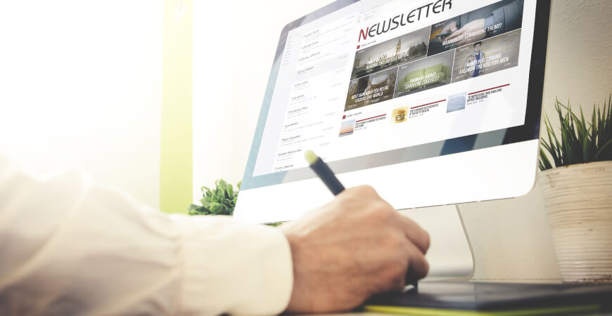
Corporate newsletters are a traditional piece of communication and have the power to tell your story, inform your audience and inspire change.
Just as important as having a website in today's marketplace, it's equally important to take good care of it. Ensuring your site is well-maintained, secure, updated, and visitor-friendly assures success now and in the future. If a website fails to be any of those things, it can quickly work against your objectives and impact user trust and brand image. So, do you have a regular maintenance plan in place?
PowerPoint decks are a staple in corporate communication. However, how they are constructed can make or break audience engagement. We’ve pegged a handful of ways to maintain audience attention when presenting your PowerPoint!
If a picture is worth 1,000 words, is an icon worth 2,000? Because icons specialize in condensing content to simple, clear imagery, they are powerful assets that can streamline copy, increase visual interest, and become an essential piece of branding.
Creativity is in high demand, and the ability to think around corners is a desirable skill across all professional fields. While inspiration and ideas can strike at any moment, several practices can increase creative performance, dynamic thinking, and innovative problem-solving.
One thing we know for sure, the creative world is ever-changing. While the principles of design are a time-tested foundation for all artistic endeavors, trends rise each year and provide fresh ways to build new visual communication and enhance existing creative.
The purpose of a brand audit is to examine your business's identity, marketing, and communication systems. Inspections are a critical step when evaluating or redesigning an existing brand.
Planning your creative, communication, and marketing efforts for the year are essential. And, smart implementation and touchpoint mapping focused on your ideal audience will promote positive results.
Every brand is presented with the challenge of maintaining effective digital asset libraries. Your marketing material, website, social media channels all require thoughtful picture consideration in helping create and maintain your brand image.
The Call to Action, aka “CTA”, is a term used for any web element that prompts users to move in a particular direction and provoke an immediate response. These days, web users find it imperative to see a Call to Action, as it is calling for their attention and providing a seamless path in which they can maneuver around a website.
It’s hard to remember a time when email was not apart of our everyday existence. With the number of email users in the world projected to reach almost 4.6 billion by 2025, we understand that emails need to stand out. Source: Statista
We've all heard it, and outside of the 'same ole, same ole,' the intended principles of this age-old advice stand true in the past, today and well into the future.
Designing your brand opens the door to many questions. One of the most important will be selecting your color palette, often defined via color meaning and your specific brand objectives.
Now, more than ever, it’s important to be mindful of our environment. Implementing this idea when delivering your brand’s message can have meaningful results.
Did you know that 67% of consumers consider image quality “very important” when making a purchase online? Quality begins with image clarity, the first representation of your offerings.
What is dimensional mail? Unlike standard, flat postcards and envelopes that overcrowd mailboxes, think about mail with length, width, AND height – boxes, tubes, containers, even pumpkins. The form and shape of a dimensional mail campaign are almost always guaranteed to yield higher response rates as recipients are offered a more dynamic, interactive experience.
Ten years already? You know the ole saying, time flies when you’re having fun! This is true for our group while building the best relationships, scrolling and clicking to the best idea, and driving creative business results.
Email signatures are critical communication touchpoints. They deliver need-to-know information, drive traffic to your organization’s website, create a branding opportunity, and provide preferred points of contact for folks to connect quicker.
For more than a year now, we’ve watched digital conference rooms become the norm due to the COVID-19 pandemic. This cost-effective environment acts as a tool for employees and clients to connect remotely, offering convenience and ease of use.
The COVID-19 pandemic continues to change the way people work worldwide, with the work-from-home model a widespread norm. With this, connectivity, productivity, and accountability are expected more than ever. Implementing the right tools and digital assets to maximize results and efficiency are paramount.
Maximizing audience engagement while minimizing spend is the name of the marketing game! Smart, creative, and pointed efforts can yield a significant impact, ensuring efficiency over the long run.
Becoming familiar with creative trends for the year ahead promotes a fresh take on new and existing visual communication. According to insight from popular design resources like 99 Designs and Behance, 2021 promises to emerge with resilience.
Yes, your brand identity is important. Yes, it should look and feel the same in every environment. And, yes, it even means internal documents, forms and files that you think may not make a difference.
Slide presentations are nothing new. Neither are decks packed with loads of content, poorly designed visuals, and lack of brand consistency. Ultimately, the size, organization, and design of your slides contribute to the presentation material's success.
Email marketing, social media, and website triggered messages are some of the best ways to build client relationships. However, the critical ‘follow-up’ can push these business-building efforts to the bottom of your list.
Officially, the Pantone Matching System is “a standard language for color communication from designer to manufacturer to retailer to customer”. This system ensures any design (and print) with a color standard appears the way it is intended – in every environment. How cool is it that this even exists?
By definition, annual reports are comprehensive summaries intended to communicate a company’s operational and financial conditions over the past year. This level of detail is essential and often a lot to digest. It is also an instance where function falls before form due to the nature of the content – or is it?
User interface (UI) refers to the visual elements that make up your site, making the design of your website important. It should consider your visitor’s user experience (UX) and boast a functional structure to ensure the best usability, accessibility, and efficiency across the board.
It’s key to understand brand standards and why they are so dang important. Whatever the brand, it needs to feel the same in every environment.
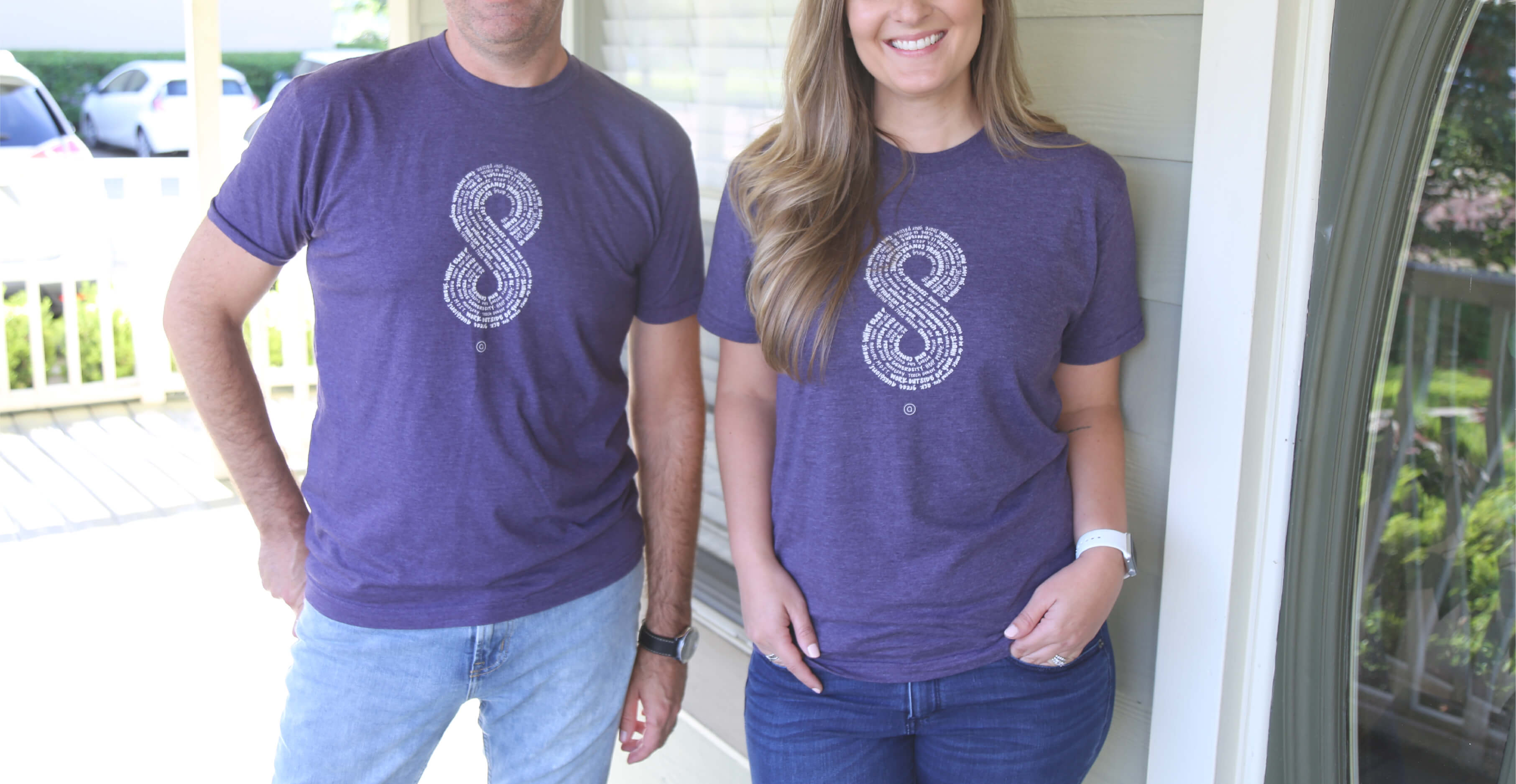
With eight years under our belt, we’re reflecting on the things that matter most and declaring our ideals through a manifesto created by us and designed for all. We strive to carry these ideologies into each and every day, seeking greatness and sharing it with others – for infinity and beyond.
Your business stationery is a reflection of your organization, and often, the first impression. Smart design and effective production can create a meaningful connection with your audience.
The holidays are synonymous with giving and good cheer. As we reflect on the year, celebrating those around you with a thoughtful holiday card may be in order.
Fall is a great time of year. The weather shifts – cool, crisp temperatures arrive – and in some parts of the country, the entire landscape of the world changes around us.
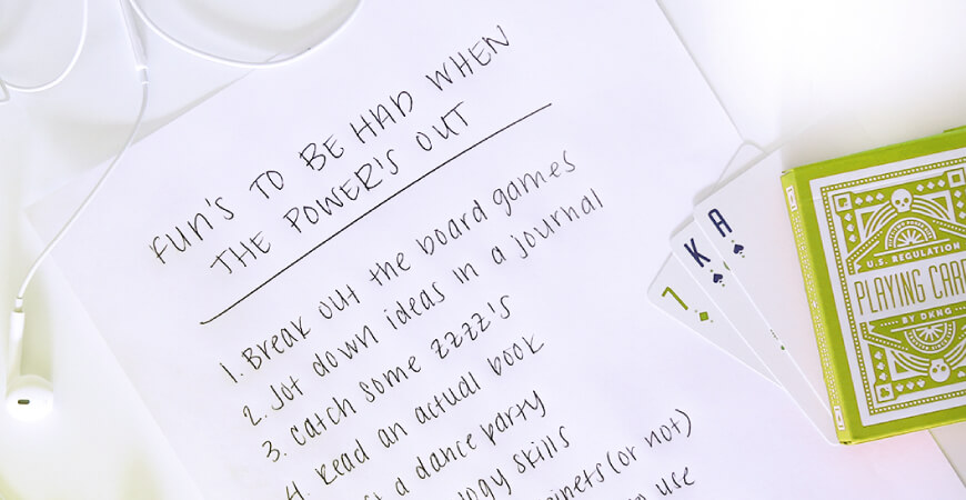
Hurricanes can be scary and even dangerous. There are many sources to help you prepare for these weather events, but few focus on what to do during when safely inside.
The world of graphic design encompasses a variety of topics, tools, and terms. Whether used for branding, print or web, each of these are helpful when trying to understand the basics.
We love three day weekends and four day weeks as much as we love delivering our creative services.
Your online presence can be powerful – and it all centers around your website. From the first impression and overall visual appeal to the underlying structure and functionality, consider the following details before you begin building your site.
Brand vision, values, and the voice should play an influential role in your visual identity and logo. It’s imperative to understand their importance and how these concepts should appear in text, form, iconography, and color.
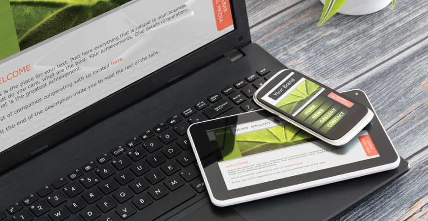
User experience and responsive website design are the invisible details associated with the experience your audience has while visiting and using your site.
In 2012, Aedieno began a monthly appreciation campaign designed to share fun and creative desktop, tablet and mobile wallpapers with our clients. The goal? To send our genuine appreciation, illustrate our creative ability, and keep a positive top-of-mind-message in view of those who chose to display the wallpaper on the device of their choice.
Like all things creative, we find ways that serve our sentiment. And, over the years we have chosen many different customs to recognize those who have given their life through serving in our armed forces.
Six years ago we took the leap to deliver quality creative services. Whether designing identities, rebranding marketing efforts, building collateral, developing websites or discussing the next big idea; sharing our dream makes us happy.
We've all heard it, and probably said it. Love what you do, do what you love... you know, the drill. At Aedieno, we take this pretty seriously.
Shaking things up creatively can be disruptive, and it may be necessary. As covered by Adage, Hershey shifted their long-held strategy for marketing each product individually to marketing "meaning and relevance" through the one master brand.
What do "three day weekends" and "creative projects" have in common? 16 characters; count 'em :) There is also a correlation to how excellent the creative process works after rest.
Independence is at the core of everything we do! The freedom to explore new ideas and improve old ones are the very concepts the 13 colonies stood for in 1776.
We love pouring ourselves into creative projects and always put serving clients at the top. Doing what we love is only possible through the commitment of many men and women who have lost their lives serving in our armed forces.
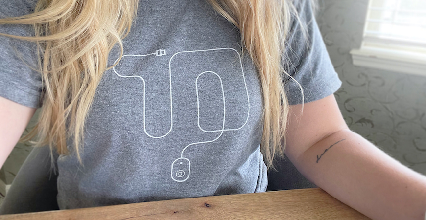
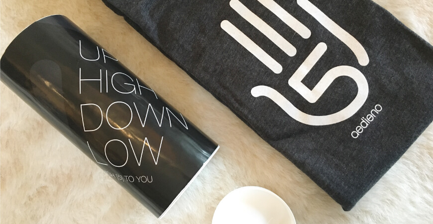
April 2016 marks Aedieno’s fifth anniversary, or as we like to say, five years of awesome! As tradition would have it, we’re excited to share this year’s anniversary t-shirt design.


