THE PANTONE MATCHING SYSTEM (PMS) EXPLAINED
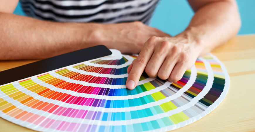
Officially, the Pantone Matching System is “a standard language for color communication from designer to manufacturer to retailer to customer”. This system ensures any design (and print) with a color standard appears the way it is intended – in every environment. How cool is it that this even exists?
It all started in the 60’s, like many other great things (ahem…bellbottoms..ahem). A printer, Lawrence Herbert, decided he would develop a way to define, match, and communicate a color by a name and a number. While initially, his intention was to solve his immediate need in the graphics industry, Pantone now serves on a much larger scale – including digital space, textiles, plastics, architecture, interiors, and paint.
Thanks to Lawrence, all it means is that your brand has no excuse, but to be consistent every time it’s seen. With a growing number of PMS colors and endless conversions, your brand can be unique, purposeful, and well-defined. Before you may have said, “Bright Red.” Now, it’s Pantone 485C, please.
Fun Fact: Did you know Pantone releases a color of the year annually? Check out what’s on trend now.
Source: Pantone
Aedieno is a boutique creative agency. For color consultation or brand strategy, creation, and implementation, please contact us.

